 Interior Formatting for Print Books, Pt. 2:
Avoiding the Visual Pattern of Rivers & Lakes~
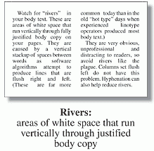
Often what will happen when you fully justify your text is the sudden appearance of rivers: areas of white space that run vertically through the body of your copy; or lakes: large holes in your text or spaces that align to make a gap to break the flow of the text.
I’m sure you’re thinking, “Yeah, so what?”
The publishing industry has long avoided this not simply because it looks bad or unprofessional but because of the way science has learned how we read. If there are blocks of space where a printed line should be, our eye tends to lose its place and begins to wander over the page. We don’t want our readers being distracted by where the words on the page are, we want them distracted by the story so that the words on the page effectively disappear.
“Okay,” you say, “so how do I fix it? I don’t want to re-write the whole paragraph.”
Unfortunately, that is exactly what you might have to do – sometimes. The extra spaces show up when writers get into a pattern with long and short words in their sentences. Changing a word here or there may be the best way to correct the unsightliness. However, there is another trick you can try first.
If you have chosen a monospaced font (like Courier, HyperFont, Letter Gothic, Lucida Consol, & anyone with the word ‘Mono’ in it ) for your copy, each letter typed takes up the same space on the page. If you change to a proportional font (like Arial, Book Antiqua, Calibri, Cambria, Constantia, Garamond, Georgia, Mangal, Tahoma, & Times New Roman), where each letter takes up its own irregular spacing, it might alleviate the blotchy appearance of the words on the page.
The most common fonts used for the body of a book are: Garamond, Minion, Dante, ITC New Baskerville, Book Antiqua, & Palatino.
Happy Editing!
Categories: Editing

These interior formatting tips (part 1 & 2) have been very helpful. Thank you!
LikeLike
You’re welcome, Diane!
Everyone is at a different stage with their manuscripts and I’ve done relatively little to address ‘final draft’ and ‘formatting’ so far… figured it was about time 🙂
LikeLike