Sometimes the best way to understand the evolution and creation of something is to see it for yourself. I have been stressing over a simple series of e-book covers for my Lost Chapter teasers. These are theoretical “chapters” in the life of the main characters of my book The Chronicles of Xannia: Time’s Tempest – chapters of their lives prior to where the book finds them. They read like short stories with brief glimpses of core or important elements that will be focused on in the main novel.
My goal is to put these Lost Chapters out for free as e-books. However, because they are not apart of my official contract with my publisher they fall into the category of “must be approved” before I can release them.
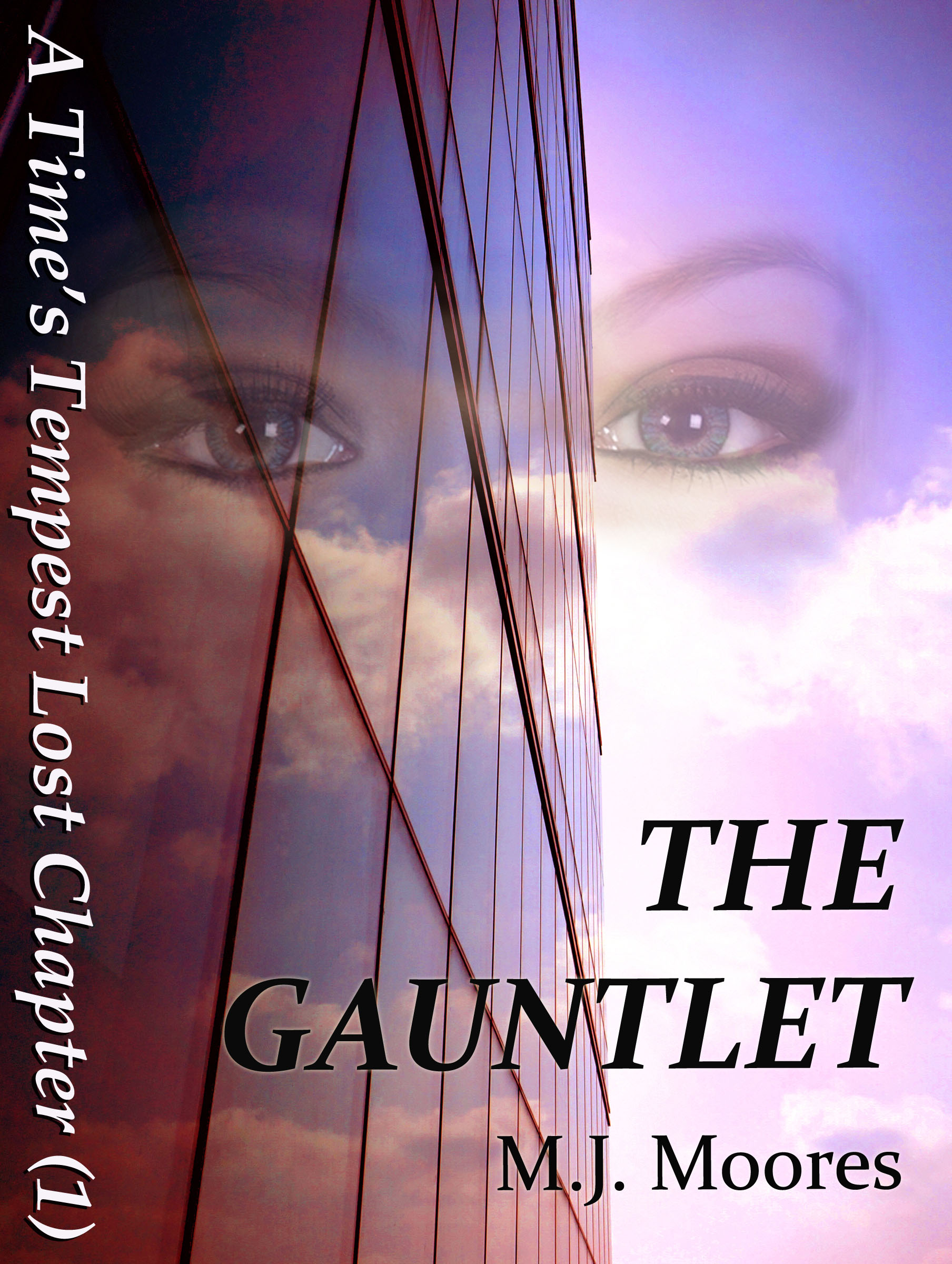 So I sent the publisher my DIY version of the cover:
The publisher balked, to say the least. My version did not convey Science Fiction at all – more of an Urban/Contemporary Thriller/Romance … I can honestly say I see this now that I’m not so close to it. So, they kindly offered to mock up a simple cover based on their impressions of the Lost Chapters and their understanding of the main book. This meant no expenses out of my pocket, so I readily agreed.
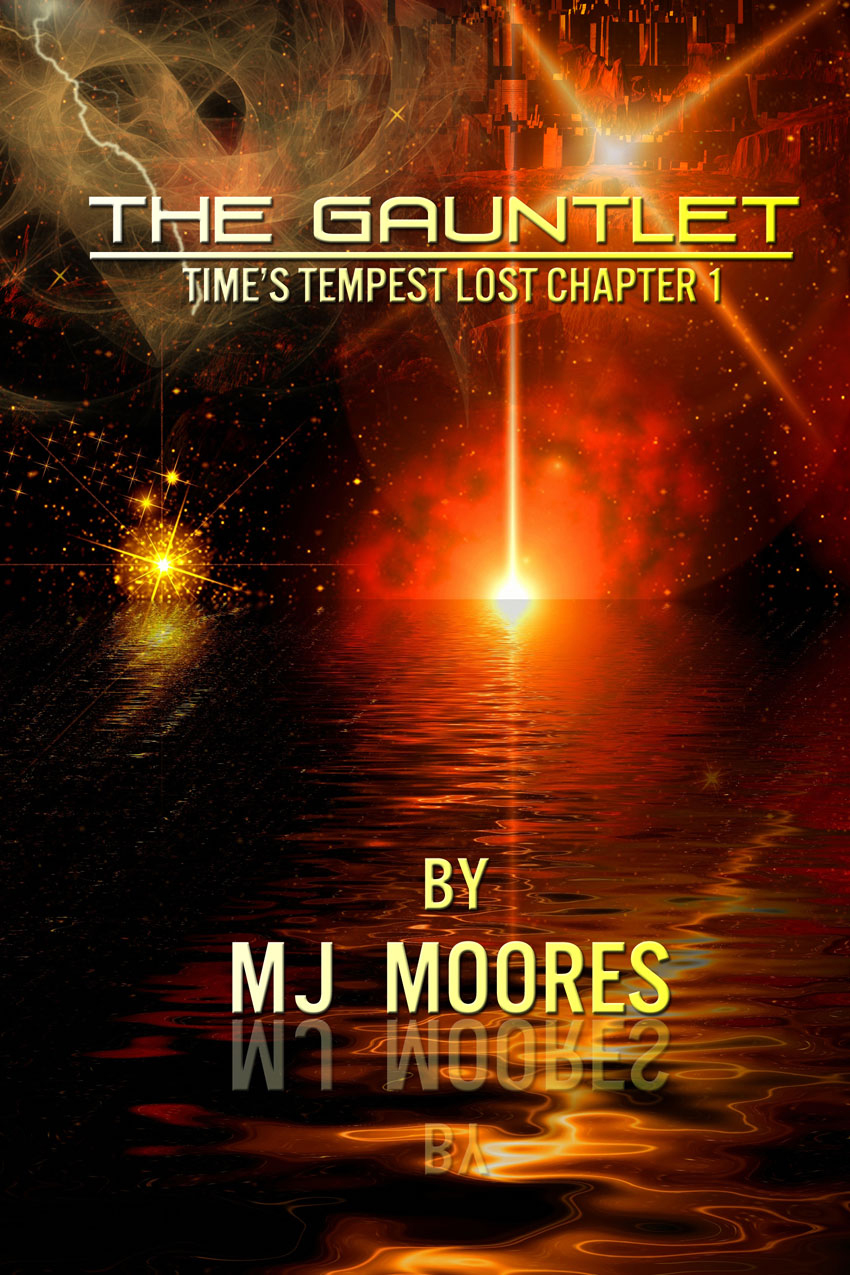
This is what I got:
 This is not at all what I envisioned the cover would look like. Yes, we talked about a textured background to give a simple title a bit of pop and elegance but we agreed on no image so that the reader would not maintain a specific impression of the main book cover yet to be designed.
The scales took me by surprise… apparently I gave the completely wrong impression of what my main species looks like and they were drawn to the wrong detail. Not only did I obviously have work to do on my first introduction of the species but this was clearly not the right cover for the free Lost Chapter series. Needless to say, I found the image of the solar system a bit on the small side and the way it’s been positioned gives the impression of a red eye in a dragon – do you see it?
This being the case, I risked offending the publisher by saying I didn’t like what they came up with. They said they didn’t have any more time to spend on a favour for a new, unproven author and if I wanted something different I would have to hire a designer.
That meant spending money on a free project that’s supposed to help me make money. Luckily, I knew someone. I had interviewed Rae Monet for an Authors Publish Magazine article called Under the Covers. Her prices were more than reasonable and her team’s work was of the highest quality. Since I was spending the money, I was going to make this as fantastic a cover a possible within my budget constraints.
So I reached out to Rae and this is the process we went through to find the “right” e-book cover for my Lost Chapters:
Initial Concept
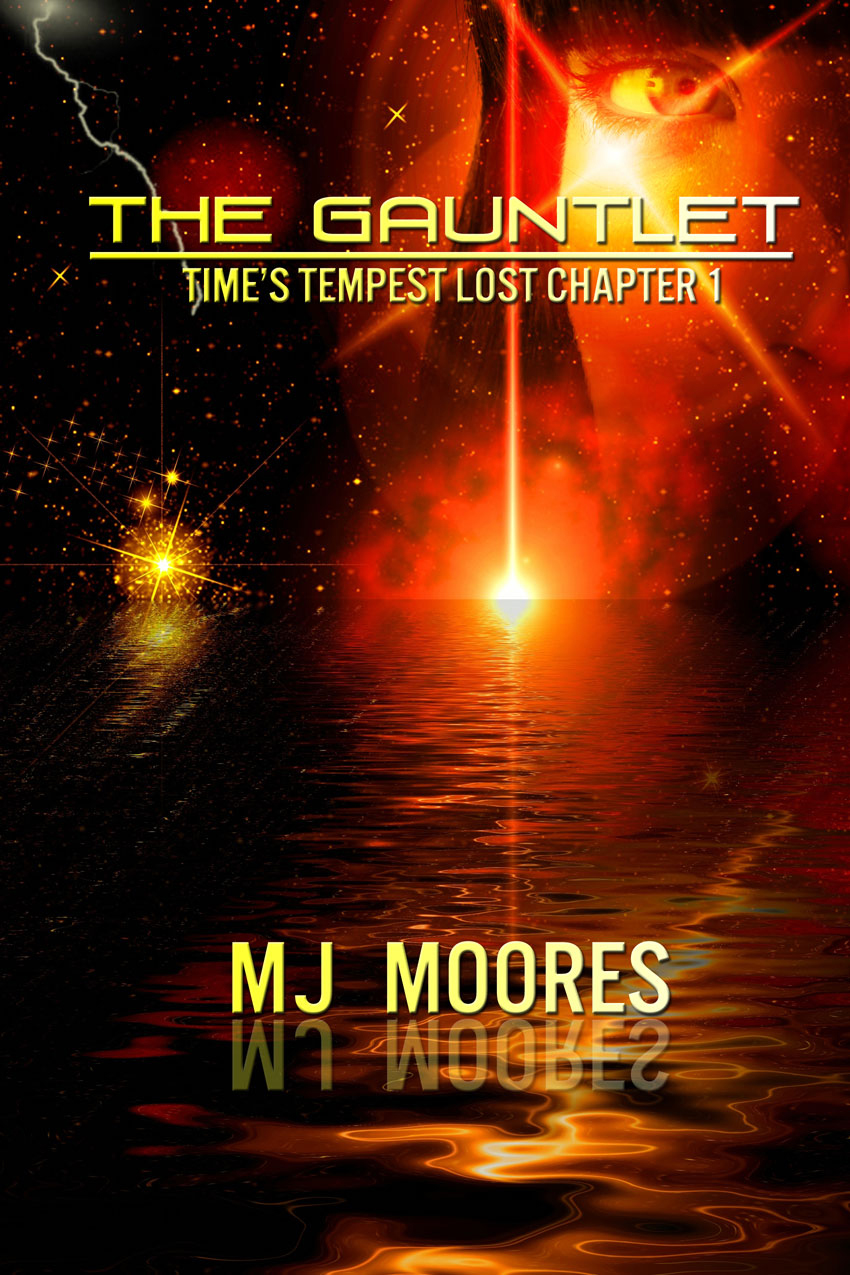
First Alteration
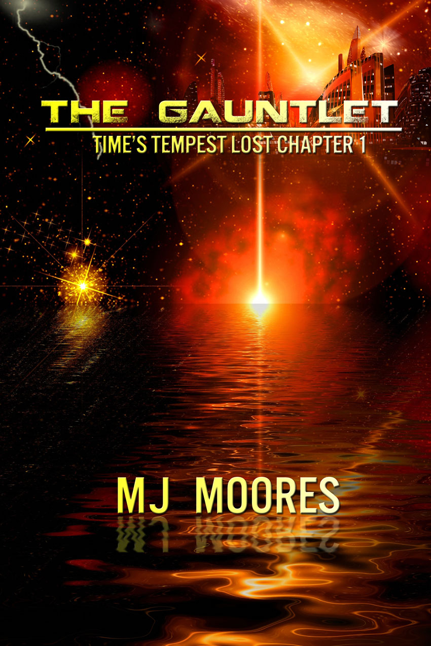
Final Version
As you’ll notice, we settled on a background pretty quickly. I found the storm cloud in the upper left corner distracting and the hint of the vast city in the upper right corner to be a bit too vague (and it was the wrong kind of city for my book). So we eliminated the swirly-storm and tried using an image for the main character instead of the city. This I liked very much. However, my publisher said they were considering doing something similar with the main character on the novel’s cover and preferred I stick with the city image. They also thought the title font was too similar to a major sci-fi TV program that used to be on the air and suggested we change it… otherwise we were looking pretty good. This was good news. As much as I love the image of my main protagonist in the upper right corner (notice I tried to do something similar with my DIY version?), I knew arguing the point with my publisher was not wise… I am just a newbie after all and they’ve been doing this longer than I have – so I took their advice. In the final version you’ll notice no storm clouds, a different title font, a wavy reflection of my name in the water, and a more accurate depiction of the main city in the novel.
And we have a winna!
Needless to say, when it comes time to putting together the cover for either your book or some freebie back stories you’d like to get “out there” to help generate some pre-buzz hype, don’t leave anything to chance and don’t sell yourself short. After all, you slaved over your manuscript, why would you “settle” for anything less when it comes to dressing it up and sending it out on its own into the big, bad world? Sometimes, you have to spend money (even on freebie stuff) to make money (in the long run).
Happy Crafting!
This link will become active when The Gauntlet – Time’s Tempest Lost Chapter #1 becomes available for free download.
Categories: Publicity

Soooooooooooo much better than what the “professional” came up with. Maybe they should try reading the book before starting a design. 🙂
LikeLike
LOL! Thanks Nanci 😀
It helps that you’ve read more than a few chapters!
LikeLike